
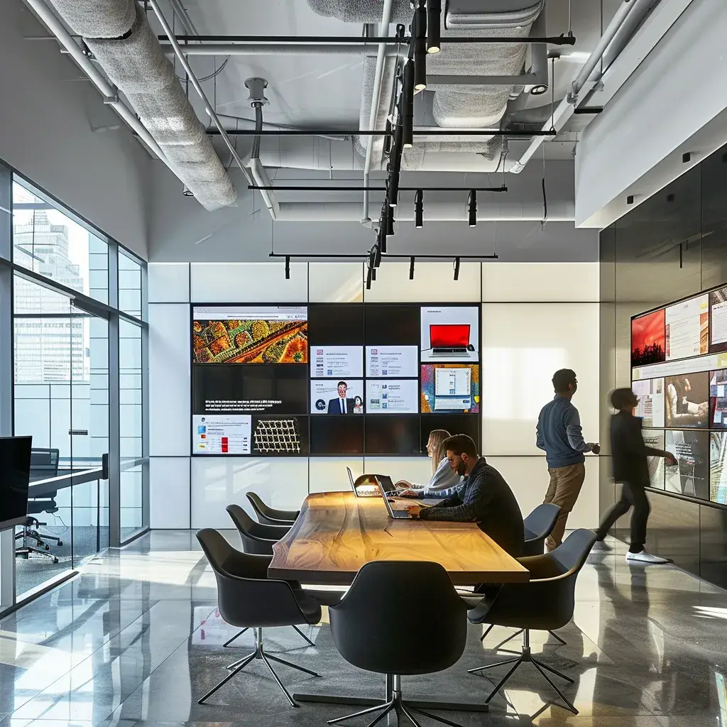
Website Layout Design Tips for Exceptional User Experience
Is your website design failing to engage visitors? A staggering 88% of online users are less likely to return to a site after a bad experience. This article presents essential website layout design tips to enhance user experience. Readers will learn how to establish a clear visual hierarchy, simplify navigation, and optimize content presentation. These strategies will address common design problems, making it easier to capture and retain visitors’ attention. By applying these tips, local businesses can create effective websites that drive traffic and boost engagement.
Establish Clear Visual Hierarchy in Your Website Layout
Effective website design in oak harbor hinges on establishing a clear visual hierarchy, which enhances user experience significantly. Using size and scale helps signal the significance of elements, while color and contrast guide users through the content. Organizing information with grids improves readability, and white space reduces clutter, focusing attention on key components. Following natural reading patterns allows content to flow seamlessly, optimizing engagement as users scroll through the page layout, especially above the fold.
Use Size and Scale to Signal Element Significance
Using size and scale is essential in guiding users through a website effectively. Larger elements naturally draw attention, signaling their importance and helping to reduce cognitive load by allowing users to quickly find what they need. For instance, a prominent call-to-action button designed with a larger size and contrasting color enhances web accessibility, making it easier for all users to navigate, especially on mobile web platforms where space is limited. Choosing an intuitive website builder with robust design features can facilitate this architectural strategy, ensuring crucial information is positioned for optimal engagement.
Apply Color and Contrast for User Guidance
Applying color and contrast in website design effectively directs user attention and enhances the overall experience. For instance, a split-screen layout can utilize contrasting hues to differentiate sections, making it easy for visitors to navigate the home page and understand the value proposition. Stock photography can further complement this approach, where images in vibrant colors draw focus to essential content, reinforcing the site’s message and engaging users effectively.
Organize Content Logically With Grids and Alignment
Organizing content logically with grids and alignment is essential for guiding user attention and enhancing overall readability. Utilizing a grid system can create a structured layout that eliminates confusion and allows users to navigate easily between sections, such as utilizing a sidebar for additional resources or links. Incorporating alignment techniques, such as using serif fonts for headings and maintaining asymmetry in images, can draw the user’s focus where it matters most, ensuring that key information stands out in an aesthetically pleasing manner.
Employ White Space to Improve Focus and Reduce Clutter
Employing white space in website layout design significantly enhances user focus and reduces visual clutter. By strategically applying the rule of thirds, designers can position essential elements in a way that aligns with natural viewing patterns, directing customer attention where it matters most. In responsive web design, sufficient white space around typography not only improves readability but also creates a more inviting browsing experience, ensuring that users can navigate the site effortlessly without feeling overwhelmed.
Follow Natural Reading Patterns for Better Flow
Following natural reading patterns is vital for creating an effective web page that promotes better flow and user experience. Implementing heat maps can help identify areas where users typically focus their attention, allowing designers to position key content strategically. Utilizing negative space effectively, along with a well-chosen color palette, encourages users to engage with important elements and navigate the site with ease, ultimately enhancing overall content management and satisfaction.
Simplify Website Navigation for Seamless User Journeys
Simplifying website navigation is key to creating seamless user journeys. Crafting intuitive menus and information structures aids in usability testing, ensuring a positive look and feel. Implementing breadcrumbs enhances user location awareness, while obvious calls to action boost conversion. Maintaining consistent navigation supports user behavior patterns, and integrating a prominent search function enhances content discoverability, all of which contribute to an effective color scheme across the site.
Craft Intuitive Menus and Information Structures
Crafting intuitive menus and well-structured information is essential for enhancing accessibility and user experience. A logical sequence in the layout allows users to navigate smoothly across multiple columns, making it easier for them to find the information they need. The integration of graphic design elements, such as icons and clear labels, within menus not only improves aesthetic appeal but also supports search engine optimization by creating a more organized content structure, ultimately driving traffic to the site.
Implement Breadcrumbs to Show User Location
Implementing breadcrumbs in website navigation significantly enhances user experience by visually indicating the user‘s location within the site hierarchy. These navigational aids allow visitors to track their path easily, reducing confusion and making navigation more intuitive. By incorporating breadcrumbs, web designers can create a seamless flow in the body text, ensuring users always have a clear understanding of where they are and how to return to previous pages, which helps keep their needs in mind when they interact with the content.
Design Obvious and Accessible Calls to Action
Designing obvious and accessible calls to action (CTAs) is fundamental for guiding users towards desired actions, ultimately reducing bounce rates and enhancing engagement. Incorporating symmetry in the layout not only makes CTAs visually appealing but also contributes to a clearer user experience. For instance, placing a mockup of a subscription form that encourages users to enter their email address can effectively capture leads while aligning with the overall strategy oak harbor of driving local business growth.
Maintain Consistent Navigation Throughout the Site
Maintaining consistent navigation throughout a website is crucial for enhancing usability and ensuring a positive user journey. This consistency allows users to easily locate key elements, such as calls to action, across various pages, improving overall web content accessibility. By implementing a grid layout and incorporating a table of contents in the design, web designers can streamline navigation, helping visitors efficiently find information while adhering to best practices in user experience research.
Integrate a Prominent and Effective Search Function
Integrating a prominent and effective search function in web design is essential for enhancing user navigation and ensuring a smooth browsing experience. This feature allows visitors to quickly find the information they seek, thereby improving the overall reputation of the brand. By applying the principle of user-centered design, a well-placed search bar can significantly facilitate access to content on a mobile app or website, making it easier for users to engage with key elements and leading to increased satisfaction.
Optimize Content Presentation for Readability
Choosing legible fonts and appropriate text sizes improves overall readability and web accessibility initiative compliance. Structuring text effectively using headings and lists aids in easy navigation. Ensuring comfortable line lengths and selecting backgrounds that enhance text comprehension are vital. Breaking down large blocks of text simplifies information delivery, making it accessible for users on mobile devices while supporting efforts like advertising in oak harbor and building a mailing list.
Choose Legible Fonts and Appropriate Text Sizes
Choosing legible fonts and appropriate text sizes is essential for enhancing readability on websites. Utilizing a font size that is easy to read across devices, paired with ample white space, ensures that users can navigate content without straining their eyes. For example, using a font size of at least 16 pixels for body text, along with a clean sans-serif typeface, can significantly improve user engagement and satisfaction by creating a more inviting atmosphere for users as they interact with the site.
Structure Text Effectively With Headings and Lists
Structuring text with clear headings and lists is vital for enhancing readability and ensuring that users can swiftly navigate through the content. Headings break up the information into digestible sections, allowing readers to identify key topics at a glance. Additionally, using lists helps organize points logically, making important information more accessible and reducing the likelihood of user frustration, which is essential in keeping visitors engaged and encouraging them to explore further.
Ensure Comfortable Line Lengths for Reading Ease
Ensuring comfortable line lengths is essential for enhancing readability on websites and improving user experience. Research suggests that optimal line length should range between 50 to 75 characters per line; this balance helps readers maintain focus without feeling overwhelmed. By structuring content to fit these guidelines, designers can facilitate smoother reading and comprehension, making it easier for users to engage with the material and navigate the site effectively.
Select Backgrounds That Aid Text Comprehension
Selecting backgrounds that enhance text comprehension is crucial for improving user experience on a website. Designers should opt for subtle colors or patterns that provide adequate contrast with the text, making it easier for visitors to read without causing strain. For example, a light gray background with dark text can reduce glare, helping to create a more inviting atmosphere that encourages users to engage with the content more deeply.
Break Down Large Blocks of Text
Breaking down large blocks of text is essential for enhancing readability and user engagement on websites. By dividing text into smaller, manageable paragraphs, designers can help visitors digest information easily, reducing the likelihood of user fatigue. This approach not only improves comprehension but also encourages users to interact with the content more effectively, making their browsing experience more enjoyable and productive.
Adopt Responsive Web Layouts for All Screen Sizes
Designing responsive web layouts is essential for ensuring an exceptional user experience across all devices. This involves adopting a mobile-first mentality to cater to the growing number of mobile users. Thoroughly testing layouts on various devices guarantees functionality, while optimizing images ensures quick loading. Ensuring touch targets are sufficiently large on mobile enhances usability, maintaining core functionality regardless of platform.
Design With a Mobile-First Mentality
Designing with a mobile-first mentality is essential in today’s digital landscape, where a significant portion of users access websites via mobile devices. Prioritizing the mobile experience allows for a streamlined layout that meets users’ needs, ensuring quick load times and easy navigation. By focusing on mobile design first, businesses can create intuitive and responsive web pages that adapt seamlessly to various screen sizes, enhancing overall user satisfaction and engagement.
Test Your Layout Thoroughly Across Various Devices
Testing website layouts across various devices is essential to ensure a seamless user experience. By utilizing multiple platforms—such as smartphones, tablets, and desktops—designers can identify any functionality issues or design inconsistencies that may hinder user engagement. Implementing real-device testing alongside emulators offers valuable insights into how content appears and behaves, guiding necessary adjustments to improve responsiveness and overall usability.
Optimize Images and Media Files for Quick Loading
Optimizing images and media files is critical for enhancing website performance and ensuring quick loading times. By using formats such as WebP or compressing images without sacrificing quality, websites can significantly reduce file sizes, leading to faster page loads. This practice not only improves user experience but also positively impacts SEO rankings, as search engines favor sites that load efficiently on both desktop and mobile devices.
Guarantee Touch Targets Are Sufficiently Large on Mobile
Ensuring that touch targets are sufficiently large on mobile devices is critical for providing a seamless user experience. Targets, such as buttons and links, should ideally meet the recommended size of at least 44×44 pixels to enhance accessibility and prevent user frustration. By designing with larger touch areas, businesses can make interactions easier, encouraging engagement and reducing the likelihood of errors, particularly for users navigating with their fingers on smaller screens.
Preserve Core Functionality on Every Platform
Preserving core functionality across all platforms is essential for delivering a seamless user experience. This includes ensuring that features like navigation menus, forms, and interactive elements work consistently, regardless of whether users are on a mobile device or a desktop. By prioritizing responsive design principles, businesses can maintain accessibility and usability, making it easier for users to engage with the website and complete desired actions, ultimately enhancing satisfaction and fostering repeat visits.
Integrate Visual Elements to Support User Engagement
Selecting high-quality, relevant imagery enhances engagement by capturing attention and conveying messages effectively. Utilizing icons aids in quick recognition and improves wayfinding, while purposeful video and animations can enrich the user experience. Upholding visual consistency aligns with brand identity, but it’s crucial to avoid overcrowding pages, as too many visuals can detract from the overall impact. Each of these elements plays a significant role in creating a seamless and engaging website layout.
Select High-Quality, Relevant Imagery
Selecting high-quality, relevant imagery is crucial for enhancing user engagement and creating a compelling website layout. Images should not only attract attention but also align with the content, reinforcing the message and purpose of the site. For instance, using authentic photographs of team members or products can foster trust and connection with visitors, ultimately encouraging them to interact more deeply with the brand.
Use Icons for Quick Recognition and Wayfinding
Utilizing icons for quick recognition and wayfinding enhances user engagement within website layouts. By incorporating easily identifiable icons, users can navigate sites with improved efficiency, reducing the time spent searching for crucial information. For example, a shopping cart icon leads customers directly to their selections, facilitating a smoother checkout process and ultimately improving conversion rates for local businesses.
Incorporate Video and Animations With Purpose
Incorporating video and animations with purpose can significantly enhance user engagement on a website. When used thoughtfully, these dynamic elements can explain complex ideas or demonstrate product features in an easily digestible format, encouraging visitors to interact more with the content. For instance, a brief product demo video can help potential customers understand the benefits of a service, making their decision-making process smoother and more informed, ultimately contributing to higher conversion rates.
Uphold Visual Consistency Aligned With Your Brand
Upholding visual consistency aligned with a brand is essential for creating a cohesive user experience that fosters trust and recognition. Consistent use of colors, fonts, and imagery reinforces the brand identity, making it easier for users to connect with the business and its values. For example, employing a uniform color palette across all pages ensures that visitors can navigate seamlessly while feeling familiar with the brand, ultimately enhancing user engagement and satisfaction.
Avoid Overcrowding Pages With Too Many Visuals
Avoiding overcrowding pages with too many visuals is essential for maintaining a clear and engaging website layout. When visuals overwhelm the content, users may feel distracted or confused, which can lead to higher bounce rates. Instead, designers should prioritize high-quality, relevant imagery that serves a purpose and complements the text, enhancing user engagement while ensuring that the overall design remains clean and focused.
Refine Website Layouts Using Feedback and Testing Methods
Conducting A/B tests to compare layout alternatives provides valuable insights into user preferences. Analyzing heatmaps reveals how visitors interact with the site, while collecting user opinions through surveys and usability tests offers direct feedback. Tracking key performance indicators related to user satisfaction allows businesses to measure success effectively. Iterating on website design based on this performance data ensures continuous improvement in user experience.
Conduct a/B Tests Comparing Layout Alternatives
Conducting A/B tests provides businesses with actionable insights into user preferences by comparing different layout alternatives. By creating two or more variations of a website layout and directing traffic to them, companies can evaluate user engagement levels, such as click-through rates and time spent on the site. This method allows for data-driven decisions that enhance user experience, ensuring that refinements align with the actual behavior of visitors, ultimately leading to improved conversion rates and stronger engagement metrics.
Analyze Heatmaps to Understand User Interaction
Analyzing heatmaps provides valuable insights into how users interact with a website, revealing where they click, scroll, and spend the most time. This data enables designers to pinpoint which elements engage visitors and identify areas that may require improvement. For example, if a call-to-action button consistently shows low interaction, it might indicate the need for a more prominent placement or enhanced visual appeal, ultimately leading to an improved user experience and better conversion rates.
Collect User Opinions Through Surveys and Usability Tests
Collecting user opinions through surveys and usability tests is a vital component in refining website layouts for an exceptional user experience. By directly engaging with users, businesses can gather valuable insights into how visitors navigate the site and identify areas that may require improvement. For example, utilizing tools like Google Forms for surveys or conducting live usability tests can reveal user preferences and pain points, empowering designers to make informed adjustments that enhance usability and overall satisfaction.
Track Key Performance Indicators Related to User Satisfaction
Tracking key performance indicators (KPIs) related to user satisfaction is essential for refining website layouts and enhancing the overall user experience. Metrics such as bounce rates, average session duration, and user engagement can provide valuable insights into how visitors interact with the site. For instance, a high bounce rate may indicate that the layout is not engaging enough, prompting businesses to reassess and improve the design elements that guide users effectively through the website.
Iterate on Your Website Design Based on Performance Data
Iterating on website design based on performance data is vital for enhancing user experience and driving engagement. By regularly analyzing metrics such as click-through rates and conversion rates, designers can identify aspects that may require modifications. Practical adjustments, such as repositioning calls to action or tweaking color contrasts, can lead to substantial improvements, ensuring the website meets user needs effectively while maintaining a focused and inviting layout.
Optimize Online Ad Spend for Small Businesses
Effective website layout design is essential for creating an exceptional user experience that drives engagement and satisfaction. By prioritizing visual hierarchy, simplifying navigation, optimizing content presentation, and adopting responsive layouts, businesses can significantly enhance usability and accessibility. Integrating high-quality imagery and conducting user feedback analysis further refines the design process, ensuring alignment with user needs and preferences. Ultimately, implementing these strategies not only fosters a seamless browsing experience but also boosts conversion rates and strengthens brand loyalty.